TECHNICAL COMPETENCE
Work that demonstrates technical competence in color theory, compositional theory, and multiple design principles, and demonstrate the ability to convey an emotion or idea.

National Pride
Personal Work
National Pride is a three-part concept where I fuse women from different countries with their national bird. Both subjects are admired for being elegant and unique; they are often seen as a nation’s cultural identity, and I wanted to associate femininity with a symbol of freedom and strength.
The subjects have a restricted palette of two to three hues to match the feathers of each bird, which directs the viewer’s attention to their peculiarities rather than its colors. The use of light and shadow is very subtle, but cool-colored highlights were used to emphasize the eyes of each subject.
The work is mostly rendered, but I aimed for a coherent outline. I was reliant on texture and repetition to achieve a semi-realistic style: There are clothing patterns for the Chinese cheongsam, gold chains for the Indian jewelry, and red-and-white shapes for the Polish flower crown. While the features are soft and smooth, some elements are sharp: the beaks, loose hair strands, and features of their profile set women and birds to be as powerful as they are beautiful.

Halloween Coloring Book Cover
Art Club Work
The Halloween Coloring Book Cover was aimed for a younger audience, so I followed design choices that would be attractive for them. I stuck with spooky elements that would not be terrifying for children, and arranged the text so that it would feel like part of the piece.
I added vertical and slim subjects to complement the dimensions of the cover, but I also included horizontal shapes and lines, especially in the smoke, that give movement to the composition and create a dynamic path for the eye. There are implied directional lines, like the bottom of the witch hat connecting the outer windows, or the way the robes join the floor by inversely mirroring the stained-glass pattern.
I used an analogous palette of red, orange, and yellow tones; this was mainly to follow Halloween’s telltale colors, but also to establish a warm and comforting atmosphere. The stained-glass shape and golden hues are inspired by 12th century Gothic architecture of cathedrals, and the composition resembles three-piece altars from Late Medieval Italy. To continue the religious parallels of my piece, I juxtaposed the smoke just like old masters would use clouds, but instead of aiming for a heavenly motif, I created a mysterious scene for the little ones.

Self Portrait with Sister
Classwork
This photo was taken for a composition assignment on Photography I. While the camera is somewhat hidden, it is a self-portrait next to my sister.
I aimed to fit the composition into the golden ratio but found a new appreciation towards other techniques to distribute the composition, like the rabatment principle. Supporting this technique, the photograph is mainly composed of rectangles and geometric derivations of it, except for the focal point, which is organic. The emphasis is facilitated by being placed within a mirror, which is framed with the most saturated value of the piece. Like most of my works, the palette is mostly limited to analogous, warm hues; my sister’s blue denim is the only cool color of the piece.
There are other elements that direct the eye towards the focal point, despite it being smaller in proportion to the objects of the room. Everything is linear and has the flat illusion that there are no vanishing points. The wood table in the bottom right, which is one of the only objects that appear in perspective, draws a line back towards the subjects. The juxtaposed mirror and blackboard also call attention to them. The right-side border of the blackboard is hidden in the middle, a discontinued line that cuts in the middle of the focal point. The viewer cannot keep their eyes away for long.

Still Life 3
Classwork
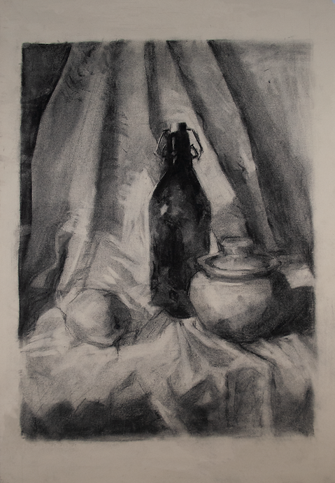
This is one of many charcoal still lifes I did during Drawing classes at SPCC. Unlike the rest, this one was referenced from a photograph rather than a physical arrangement. I had to make different variations of the same still life; the one in question was the third drawing. The assignment was a perfect way to remember charcoal techniques, which had been put to rest for a year.
I find comfort in charcoal because it allows me to focus on values and techniques rather than color theory. During this time, I was studying the works of Yim Maukun, whose charcoal and graphite drawings had a blocky approach to shadows that is appealing to me. An art concept with a similar style is stroke economy, typically used in oil paintings, where the number of brush strokes is visually reduced while retaining the essence of the subject.
The two influenced my present drawing, which is both realistic and stylized. The proportions, lights, and shadows are true to life, but the midtones are playful with decorative patterns and painterly rendering. There are also small, parallel strokes scattered around the cloth to hint towards an intricate pattern from the reference photo. While it was not fully drawn, the unfinished look is more appealing and creates movement with implied lines. Aside from relearning the medium, I used this assignment as an opportunity to be more confident on my artistic choices instead of a mindless replica of the subject.